Design Tips For A More Professionally Looking LED Neon Sign.
LED neon signs are the best signage option if you want to make your business stand out. It is impossible to miss these bright and captivating LED neon signs in a corporate environment. But just because something is bright and shiny doesn’t always mean it looks good. If the LED neon sign doesn’t have a suitable design, the right colours, or the right image layout, it can turn out looking a little bit tacky.
Fortunately, there are some steady rules you can follow if you want to create an LED neon sign with a more polished and professional look. Here are some of the best ways to ensure that your LED neon sign turns out well.
Keep Signage Simple and Readable
Including too much detail in your LED neon sign is a sure way to fail. When signage becomes too detailed, it can become difficult to read. This is especially true for illuminated LED neon signs. The illuminated tubes can start blending too much, and you could end up with a LED neon sign that looks more like a blurry light.
Ideally, you should try to keep the LED neon sign simple with just 2 to 5 words per sign. The font should be clean and legible even from a distance. There should also be ample spacing between letters, lines, and icons so everything won’t blend together too much. Even iconic images or logos should be kept clean with a minimalist effect.
Use a Balanced Colour Palette
Colours are very important, especially if you want to create something with a professional feel. Using too many colours in your LED neon sign will only make everything look messy. Ideally, your LED neon sign should only consist of 1 - 3 colours. These chosen colours can be cohesive for a more uniform appearance or contrasting for better visibility or better distinction between text and image.
The colour palette you choose will also determine the feel of your LED neon sign. Warmer tones like reds, pinks, or amber hues tend to give a more cozy or energetic feel. Cooler tones like greens, purples, or blues can be a better option if you want a calm, modern effect.
Keep the Background in Consideration
LED neon signs can be mounted on various backing materials. However, most modern LED neon signs are installed on clear acrylic backing so they can be installed on any surface without appearing blocked in. Choosing a clear backing for your LED neon sign is a great idea since it will make it possible to install your LED neon signage in windows, or on any wall surface and colour. Only the neon tubing will be visible when the LED neon sign is turned on, which creates a very professional effect.
Consider Symmetry
Symmetry can make anything appear more aesthetically pleasing and professional. When you are still developing your LED neon sign design, you should pay attention to symmetry and ensure that everything is balanced out.
Various layouts including vertical, including vertical, rectangular, square, or even triangular, can be used for your LED neon sign. The image and text content should be cohesively placed within this layout space, or your LED neon sign can end up looking unbalanced.
Consider LED UV-Printed Neon Signs
If you do want to include lots of graphic detail in your LED neon sign, then it is best to consider LED UV-printed neon signs. This type of LED neon sign can be more detailed because neon UV ink is used within the LED neon sign. Instead of just tubes, the inked text or image will also be illuminated.
Even with this type of signage, it is best not to overdo things with too much text or imagery that is too detailed. Most printed LED neon signs turn out better with a minimalist yet captivating design.
Get Help Designing the Perfect LED Neon Sign
If you are having a tough time bringing the design of your new LED neon sign to life, then you can always reach out to Neon Party for assistance. Our support team can help you create a captivating LED neon sign that looks professional and matches your company perfectly.
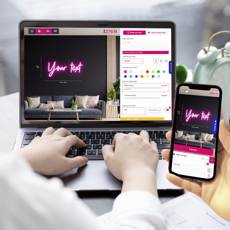
Check out our easy-to-use online custom design tool Neon Party to get started on your beautiful business sign.